Back to AQA Representing Data (H) Home
6.2 F) Pie Chart – Part 1
6.2 F) Pie Chart – Part 1
Pie charts are circles that show the proportion that each group represents fairly quickly. For example, the pie chart below shows how individuals get to school.
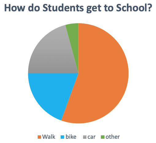
The greater the section on the pie chart, the greater number of individuals in that group. The key at the bottom shows us the 4 modes of transports that appear in our pie chart. The modes of transports are walking (orange), biking (blue), car (grey) and other (green).
From the pie chart we can see that orange makes up the greatest proportion of the pie chart and this means that walking to school is the most popular way of getting to school.
Also, we can see that the blue section and grey section are roughly the same size. This means that the number of individuals that get to school by bike (blue) or by car (grey) are roughly the same.
Finally, the smallest section on the pie chart is the green section, which means that not many people are in the other category (the other category would include stuff like getting to school by bus, train, scooter etc.).
Creating a Pie Chart
We are now going to look at creating a pie chart. In order to create a pie chart, we need to find the proportion of the full circle that each group represents, and we find this proportion in degrees.
Example 1
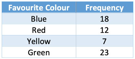
Draw a pie chart for the following data.
We are now going to look at creating a pie chart. In order to create a pie chart, we need to find the proportion of the full circle that each group represents, and we find this proportion in degrees.
Example 1
Draw a pie chart for the following data.
There are two different methods for working out the number of degrees that each category represents.
Method 1
The first step in answering this question is to find the proportion of the circle that each group represents. The best way to do this is to find out how many degrees one value (or individual) represents on the pie chart. We then multiply the number of degrees that one value (or individual) represents by the frequency of the group. To find out what one value (or individual) represents in degrees, we divide 360° (the full circle), by the number of values (or individuals) that are in our data set. The formula is shown below:
The first step in answering this question is to find the proportion of the circle that each group represents. The best way to do this is to find out how many degrees one value (or individual) represents on the pie chart. We then multiply the number of degrees that one value (or individual) represents by the frequency of the group. To find out what one value (or individual) represents in degrees, we divide 360° (the full circle), by the number of values (or individuals) that are in our data set. The formula is shown below:

We obtain the number of values in our data set by adding up the frequencies for each of the groups. The number of values in our data set is 60 (18 + 12 + 7 + 23). We find what one value represents by subbing in 60 for the number of values.
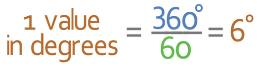
Therefore, 1 value in the data set is equal to 6°. We are now able to find the number of degrees that each group represents by multiplying the frequency of each of the group by 6° (the number of degrees that one value represents).
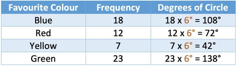
After you have found the degrees for each of the groups, it is a good idea to add all of the degrees up to check that they add up to 360°, which is the number of degrees in the whole circle/pie. The degrees for the four groups adds up to 360°, which implies that we have completed the working correctly. The reason why I suggest doing this early is because it is much better to find out that you have made a mistake at this stage rather than when you are drawing the pie chart.
Method 2
The second method finds the number of degrees that each group represents straight away. The formula for the second method is:
The second method finds the number of degrees that each group represents straight away. The formula for the second method is:

The working is shown in the table below.
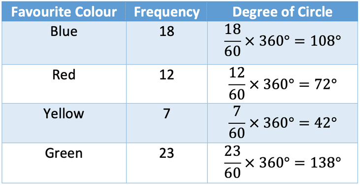
Both methods give us the same answers for the degrees of the circle that each group represents.
Drawing the Pie Chart
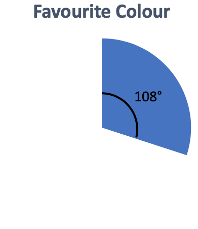
We are now able to draw the pie chart for the data. We do this by drawing one line on the pie chart; usually we draw this line going directly upwards from the centre of the pie chart to the top. We then measure 108° from this line. The area between these two lines will represent the proportion of all individuals who have blue as their favourite colour. I am going to colour this area blue.
We are now able to draw the pie chart for the data. We do this by drawing one line on the pie chart; usually we draw this line going directly upwards from the centre of the pie chart to the top. We then measure 108° from this line. The area between these two lines will represent the proportion of all individuals who have blue as their favourite colour. I am going to colour this area blue.
We then draw 72° from the line that we have just drawn, and this will give us the area that represents the colour red. I am going to colour this area red. We then do the same for yellow and green.
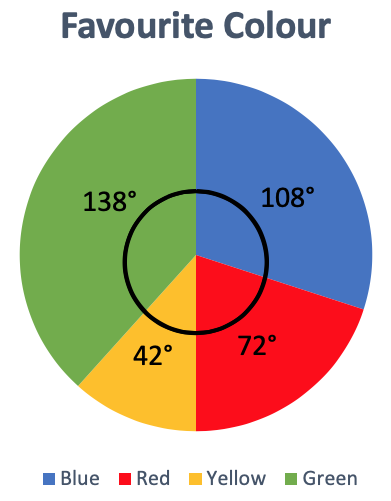
The final step is to create a key to show which areas represent what. The key for our pie chart is at the bottom of the above pie chart.