Back to AQA Representing Data (H) Home
6.2 J) Cumulative Frequency Graphs – Part 1
6.2 J) Cumulative Frequency Graphs – Part 1
Cumulative frequency is the running total of the frequencies. We obtain the cumulative frequency by adding up the frequencies for the lower/ preceding groups (this will make more sense when we have a look at an example). A cumulative frequency graph plots cumulative frequency against another variable that is able to be ranked (which could be anything, such as height, age, marks on a test etc.). Cumulative frequency is plotted on the y-axis and the other variable is plotted on the x-axis.
Cumulative frequencies graphs are useful because we can easily calculate the median and quartiles (lower and upper) for grouped data. We will be looking at this in the next section.
Cumulative frequencies graphs are useful because we can easily calculate the median and quartiles (lower and upper) for grouped data. We will be looking at this in the next section.
Example 1 – Drawing a Cumulative Frequency Graph
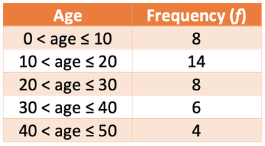
Draw a cumulative frequency graph from the data below of the age of a group of individuals.
Draw a cumulative frequency graph from the data below of the age of a group of individuals.
We calculate the cumulative frequency by adding the frequencies of the group in question and all of the groups that are lower than the group that we are working the cumulative frequency for.
On the cumulative frequency graph, we plot the cumulative frequency against the upper boundary of the class. This is because we are dealing with grouped data, which means that we do not know the exact values of the data. Therefore, we can only say that the cumulative frequency that we have worked out definitely happens at the upper limit.
I have added an upper boundary column and a cumulative frequency column.
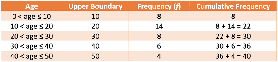
We now have all of the information that we need to draw our cumulative frequency graph. Age will be on the x-axis of our graph and cumulative frequency will be on the y-axis. We plot the upper boundary against the cumulative frequency. For example, the first point that we will plot is an age of 10 (the upper boundary for the 0 < age ≤ 10 group) against a cumulative frequency of 8. We plot all of the other values from the table. The final point that we need to plot is a cumulative frequency of 0 against the lower boundary of the lowest group. The lower boundary of the lowest group is 0. Therefore, we plot an age of 0 against a cumulative frequency of 0. The plotted points are shown on the graph below.
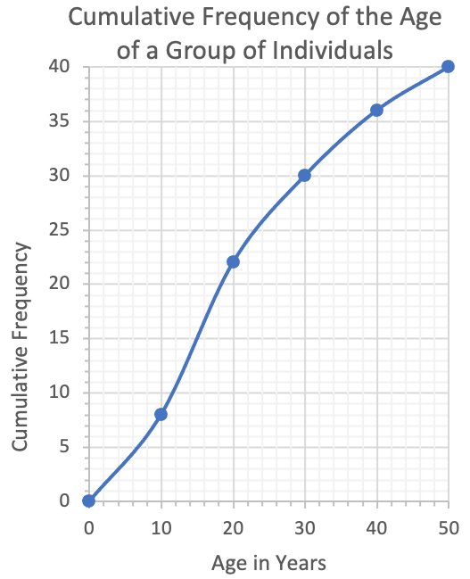
We then draw a smooth curve that passes through all of the plotted points. Cumulative frequency curves will usually have a nice “S” shape like the graph above. However, sometimes they won’t have a nice “S” shape, so do not be alarmed if this is the case.
Example 2
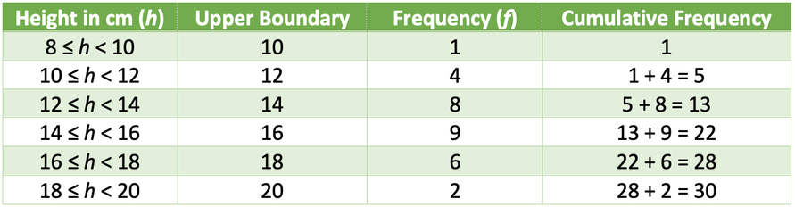
The table below shows the height of tomato plants in my green house.
The table below shows the height of tomato plants in my green house.
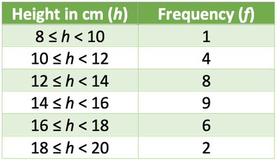
Draw the cumulative frequency graph for the data above.
We calculate the cumulative frequency by adding the frequencies of the group in question and all of the groups that are lower than the group that we are working the cumulative frequency for.
On the cumulative frequency graph, we plot the cumulative frequency against the upper boundary of the class. This is because we are dealing with grouped data, which means that we do not know the exact values of the data. Therefore, we can only say that the cumulative frequency that we have worked out definitely happens at the upper limit.
I have added two additional columns for upper boundary column and a cumulative frequency to the table.
We now have all of the information that we need to draw our cumulative frequency graph. Height of the tomato plants will be on the x-axis and cumulative frequency will be on the y-axis. We plot the upper boundary against the cumulative frequency. For example, the first point that we will plot is a height of 10 (the upper boundary for the 8 ≤ h ≤ 10 group) against a cumulative frequency of 1. We plot all of the other values from the table. The final point that we need to plot is a cumulative frequency of 0 against the lower boundary of the lowest group. The lower boundary of the lowest group is 8 (the lowest group is 8 ≤ h < 10). Therefore, we plot a height of 10 against a cumulative frequency of 0. The plotted points are shown on the graph below.
After all of the points have been plotted, we draw a smooth line passing through all of the points. Our cumulative frequency graph is shown below.
After all of the points have been plotted, we draw a smooth line passing through all of the points. Our cumulative frequency graph is shown below.
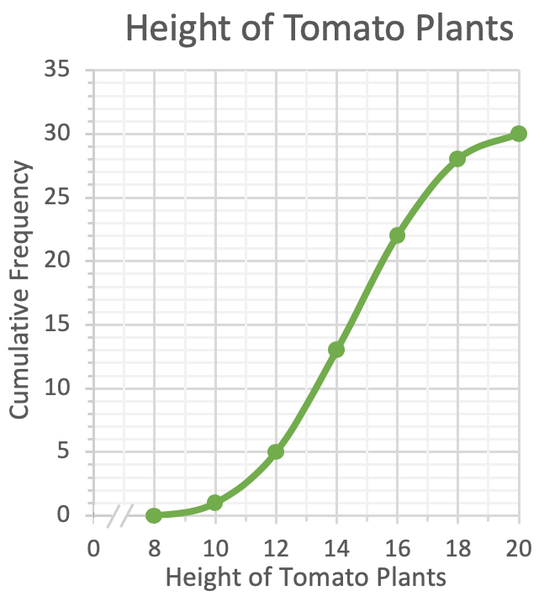
The // on the graph below is an axis break. This allows us to start the values on the axis from a value closer to the data rather than starting from 0 and having a large part of the axis blank.