Back to Edexcel Representing Data (F) Home
6.2 B) Bar Chart – Part 1
6.2 B) Bar Chart – Part 1
A bar chart can be used to show the frequency of different outcomes happening. We can use bar charts to represent grouped continuous data or qualitative data. The height of the bars in the bar chart represent the frequency of that group/ particular outcome. Bar charts can have the bars vertically or horizontal depending on how the individual wishes to display the data. Usually, you will see bar charts where the bars are vertical (the example below will have vertical bars).
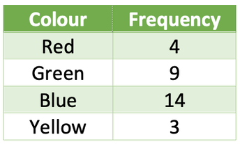
For example, I asked 30 people what their favourite colour was out of red, green, blue and yellow. The table below shows my results.
For example, I asked 30 people what their favourite colour was out of red, green, blue and yellow. The table below shows my results.
Draw a bar graph for this data with vertical bars.
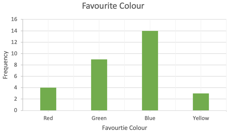
We are going to be creating a bar chart with vertical bars, and this means that the colours will be shown on the x-axis and the frequency on the y-axis. The data that we have is qualitative data and this means that it does not matter the order that we place the colours on the x-axis (with quantitative data, we should always order our groups/ values in ascending order. But as qualitative data cannot be ordered, there is no particular order for the different colours). When we have labelled the colours on the x-axis, we can plot the frequencies and create bars for each of the colours. With bar charts, we need to make sure that there is a gap between all of the bars. The bar chart is shown below.
We are going to be creating a bar chart with vertical bars, and this means that the colours will be shown on the x-axis and the frequency on the y-axis. The data that we have is qualitative data and this means that it does not matter the order that we place the colours on the x-axis (with quantitative data, we should always order our groups/ values in ascending order. But as qualitative data cannot be ordered, there is no particular order for the different colours). When we have labelled the colours on the x-axis, we can plot the frequencies and create bars for each of the colours. With bar charts, we need to make sure that there is a gap between all of the bars. The bar chart is shown below.
Bar charts are useful because we can quickly see what the mode is; the mode is the most common observation (remember MO appears in both MOde and MOst). The tallest bar will be the mode. For the above graph, the tallest bar is blue, which means that blue is the mode for this data.
Example 2
We are now going to have a look at an example whereby we are given a partially completed bar chart and table. We will then be asked to complete the bar chart and find the missing values for the table. We will always be given either the bar or a value in the table for each of the options. Let’s have an example.
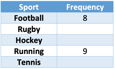
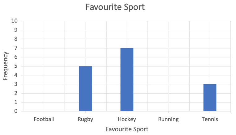
The students in a class were asked what their favourite sport was out of football, rugby, hockey, running and tennis. The partially completed table and bar chart are shown below.
Complete the bar chart and fill in the missing values in the table.
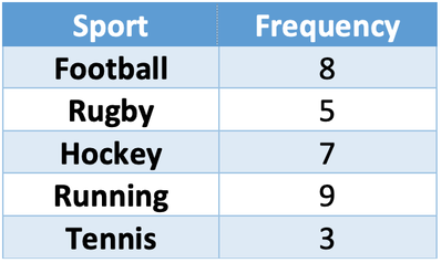
It does not matter whether we complete the bar chart or fill in the table first. I am going to fill in the table first. The gaps in the table are for rugby, hockey and tennis. We find the frequencies for these sports by looking at the bar chart. According to the bar chart, 5 people liked rugby the most, 7 people liked hockey the most and 3 people liked tennis the most. We can add these values to the table and the completed table is shown below.
It does not matter whether we complete the bar chart or fill in the table first. I am going to fill in the table first. The gaps in the table are for rugby, hockey and tennis. We find the frequencies for these sports by looking at the bar chart. According to the bar chart, 5 people liked rugby the most, 7 people liked hockey the most and 3 people liked tennis the most. We can add these values to the table and the completed table is shown below.
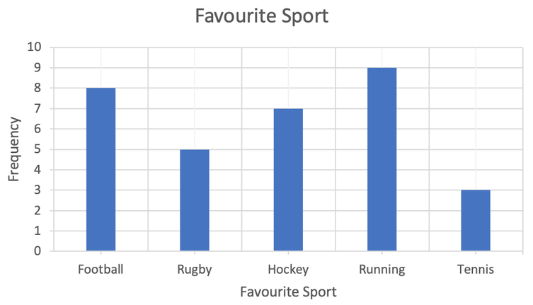
I am now going to complete the bar chart. Currently the bar chart is missing bars for football and running. The table gives us the frequencies for football and running; we are told that 8 people like football the most and 9 people like running the most. We can draw the bars for football and running from this information. The completed bar chart is shown below.
An Extension
What sport is the mode?
The mode is the most common observation (remember MO appears in both MOde and MOst). On a bar chart, the mode is the tallest bar. The tallest bar on the above bar chart is running. Therefore, the mode is running.
What sport is the mode?
The mode is the most common observation (remember MO appears in both MOde and MOst). On a bar chart, the mode is the tallest bar. The tallest bar on the above bar chart is running. Therefore, the mode is running.

