Back to Edexcel Representing Data (F) Home
6.2 D) Bar Chart – Part 3
6.2 D) Bar Chart – Part 3
Comparative bar charts are used to easily compare data. There are two different types of comparative bar charts; a compound bar chart and a grouped bar chart.
Compound Bar Chart
The bars in a compound bar chart are split into sections to show the breakdown of data. For example, in an earlier section, we had some data about the number of siblings that class members had. The data is given below.
The bars in a compound bar chart are split into sections to show the breakdown of data. For example, in an earlier section, we had some data about the number of siblings that class members had. The data is given below.
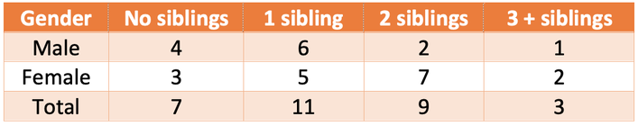
The data above has been split up into males and females and it would be nice to show this information on a bar chart. I am going to be creating a bar chart that plots the total frequency against the number of siblings (no siblings, 1 sibling, 2 siblings and 3 or more siblings). In addition, I am going to split each of the bars into two sections; the number of males in that category and the number of females in that category.
The bar chart is given below.
The bar chart is given below.
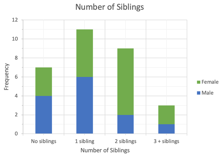
It is essential that compound bar charts have a key. From the key, we can see that the blue part of the bars represents males and the green parts of the bars represent females.
We can see from the bar chart that the mode for the number of siblings is 1 and of the individuals that have 1 sibling, 6 of them are males (the blue part of the bar) and 5 of them are female (the green part of the bar). The total height of the bar tells us the total number of individuals (male and female) that are in that category. There are 11 individuals who have one sibling (6 male and 7 female).
We can see from the bar chart that the mode for the number of siblings is 1 and of the individuals that have 1 sibling, 6 of them are males (the blue part of the bar) and 5 of them are female (the green part of the bar). The total height of the bar tells us the total number of individuals (male and female) that are in that category. There are 11 individuals who have one sibling (6 male and 7 female).
Grouped Bar Chart
A group bar chart is where there are two or more bars for each category. These types of bar charts are very useful for comparing data and they are commonly used to compare data between different years, or months.
Businesses often use grouped bar charts to give a quick representation of how the business is performing. For example, there is a bar chart below for a cinema that compares the revenue and costs for a variety of different activities that the cinema undertakes.
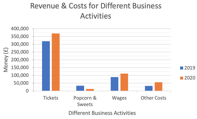
The first two categories for the cinema are the revenue (money that is coming into the company) and the final two categories are costs (money that is leaving the cinema; expenses that the cinema has to pay). The blue bars represent the values in 2019 and the orange bars represent the values in 2020.
By quickly looking at the bars on the bar chart, we can see that revenue from tickets increased from 2019 to 2020 (the orange bar is higher than the blue bar). However, revenue from popcorn and sweets has decreased between 2019 and 2020 (the orange bar is lower than the blue bar for popcorn and sweets). Also, we can see that wages and other costs have increased between 2019 and 2020 (the orange bar is higher than the blue bar for both wages and other costs).
By quickly looking at the bars on the bar chart, we can see that revenue from tickets increased from 2019 to 2020 (the orange bar is higher than the blue bar). However, revenue from popcorn and sweets has decreased between 2019 and 2020 (the orange bar is lower than the blue bar for popcorn and sweets). Also, we can see that wages and other costs have increased between 2019 and 2020 (the orange bar is higher than the blue bar for both wages and other costs).