Back to OCR Maths Foundation June 2018 Paper 2 Home
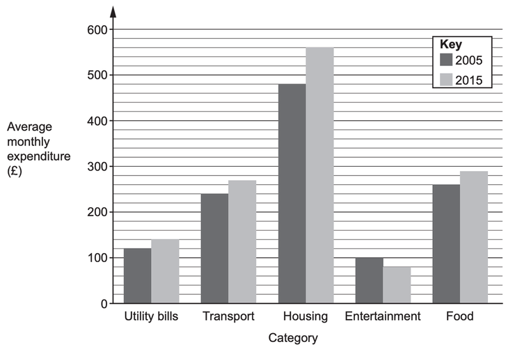
Q6: Answers – Paper 2 – June 2018
Q6: Answers – Paper 2 – June 2018
Helpful Links
Mark Scheme
Working
Working coming soon!
Working coming soon!
Question
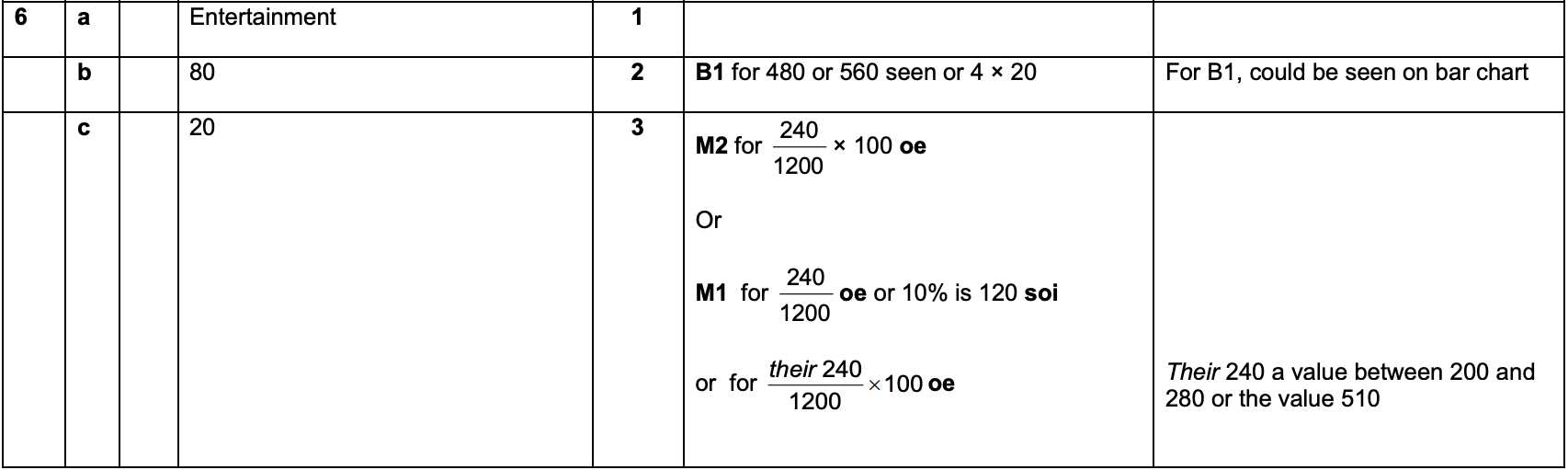
6) This bar chart shows the average monthly expenditure, by category, of households in a particular town in 2005 and 2015.
a) In which category was there a decrease in the average monthly expenditure between 2005 and 2015?
[1 mark]
b) How much more was the average monthly expenditure on housing in 2015 than in 2005?
[2 marks]
(c) The total average monthly expenditure in 2005 was £1200.
What percentage of this was spent on transport?
[3 marks]